Understanding Icons and Their Importance
Icons are an integral part of visual communication, serving as graphical representations of concepts, actions, or objects. In the digital age, icons have grown beyond simple illustrations to become powerful tools in design and branding. Understanding their purpose and usage can significantly influence user experience and engagement. For instance, websites leverage icons to guide, inform, and enhance the usability of their platforms. This article delves into the art and science of icons, exploring their types, design principles, effective usage, and emerging trends in iconography.
What Are Icons?
Icons are typically small images or symbols that convey specific meanings or ideas at a glance. They simplify complex concepts or actions into easily recognizable visuals. Used widely in user interfaces, applications, and websites, icons can enhance communication with users by providing intuitive visual cues. For example, a shopping cart icon universally indicates an e-commerce platform’s cart functionality, making navigation straightforward for users.
The Role of Icons in Design
In design, icons play a multifaceted role:
- Simplification: Icons distill complex ideas into simple visual forms, making content more digestible.
- Navigation: They act as signposts guiding users through digital spaces, enhancing usability.
- Brand Identity: Unique icon designs contribute to brand recognition and convey personality.
- Visual Hierarchy: Icons help establish the flow of information, directing focus to important elements.
The thoughtful application of icons can elevate the overall aesthetic and functionality of design projects, resulting in a cohesive user experience.
Examples of Icon Usage across Industries
Icons find their applications across numerous sectors, each harnessing their potential to improve functionality and user interaction:
- Technology: Smartphone applications frequently use icons for settings, notifications, and navigation to streamline operations.
- E-commerce: Shopping sites utilize cart, wishlist, and product status icons to enhance shopping experiences.
- Healthcare: Patient management systems rely on icons for various operations like appointments, medical history, and emergency contacts.
- Education: E-learning platforms integrate icons to signify different categories such as quizzes, assignments, and resources, making navigation straightforward for users.
Types of Icons and Their Characteristics
The diversity of icon styles allows designers to choose forms that best fit their project needs. Each type of icon has unique attributes and intended uses, impacting their effectiveness in communication:
Flat Icons: Simplicity Meets Functionality
Flat design icons are characterized by their minimalist aesthetic. They avoid three-dimensional elements, gradients, and complex textures, opting instead for solid colors and clean lines.
Key Characteristics:
- Minimalism: They embrace a clean look, often with bold colors that enhance visibility.
- Versatility: Flat icons can easily adapt to various themes and styles, making them widely applicable in web and mobile design.
- Fast Loading Times: Their simplicity typically leads to lower file sizes, ensuring faster load times on websites.
Flat icons are prominently used in modern web design, reflecting a trend towards simplicity and user-centric design.
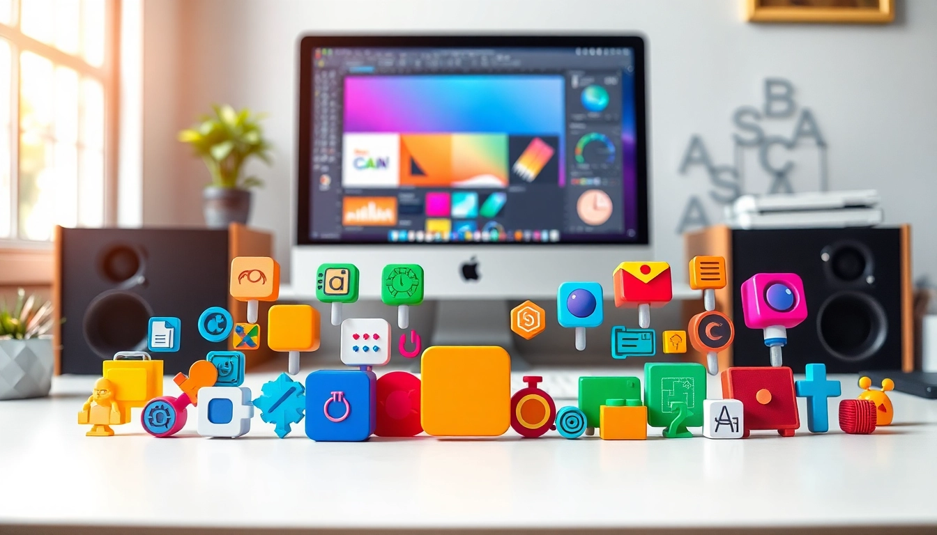
3D Icons: Depth and Dimension
3D icons introduce layers and depth, often using gradients, shadows, and highlights to create a sense of realism. These icons provide a tactile quality to digital interfaces.
Key Characteristics:
- Realism: They simulate physical objects, making them relatable and engaging.
- Visual Appeal: The depth involved can draw users’ attention and create a sense of interaction.
- Brand Storytelling: 3D icons can enhance narratives by adding layers of meaning and context.
While they can add significant aesthetic value, 3D icons may increase the design complexity and load time if not optimized effectively.
Animated Icons: Adding Life to Your Design
Animated icons combine visuals and movement to grab attention and guide user actions. These dynamic elements can illustrate processes or provide feedback in user interactions.
Key Characteristics:
- Engagement: Animation catches the eye, potentially increasing user interaction rates.
- Instructional Value: Animated icons can demonstrate functionality, especially for new users who may require guidance.
- Brand Differentiation: Unique animations can set a brand apart from competitors, contributing to a strong identity.
However, it’s vital to use animations judiciously to avoid overwhelming users or detracting from the content.
Designing Your Own Icons
Creating custom icons involves a thoughtful approach that aligns with the project’s objectives and audience needs. Following sound design principles and leveraging appropriate tools is essential for successful icon creation.
Essential Design Principles for Icons
Designing effective icons entails understanding several core principles that govern good iconography:
- Clarity: Icons should be easily recognizable and convey their intended message without ambiguity.
- Consistency: Maintain a cohesive style across all icons to strengthen brand identity and visual harmony.
- Functionality: Icons must serve a purpose within the design, enhancing usability and guiding user actions.
- Scalability: Icons should remain legible and visually appealing at different sizes, ensuring versatility across platforms.
By adhering to these principles, designers can create icons that not only look good but also function effectively within the user’s context.
Tools and Software for Icon Creation
Various tools are available for icon design, catering to different skill levels and design requirements:
- Adobe Illustrator: A premier vector design tool ideal for creating detailed and scalable icons.
- Sketch: A favored application among UX/UI designers, offering efficient icon design capabilities.
- Figma: A cloud-based collaborative design tool that’s perfect for teams tasked with icon development.
- Inkscape: An open-source vector graphics editor suitable for beginners and advanced users alike.
- Affinity Designer: A versatile design software that provides excellent tools for icon creation without subscription fees.
Experimenting with various tools can help designers find the best option that suits their workflow and project requirements.
Color Theory and Icon Design
Color plays a crucial role in icon design, influencing perception and emotional response. Understanding color theory can dramatically enhance the effectiveness of icons:
- Color Psychology: Different colors evoke specific emotions and associations. For instance, blue often denotes trust, while red can signify urgency.
- Contrast: High contrast enhances visibility and legibility, crucial for effective icon design.
- Brand Colors: Leveraging brand-specific colors helps solidify identity and maintain consistency across designs.
By thoughtfully applying color theory, designers can create icons that resonate with users and effectively communicate brand values.
Using Icons Effectively in Digital Projects
Incorporating icons within digital projects requires thoughtful strategies to maximize their impact on usability and design aesthetics.
Best Practices for Icon Sizing and Placement
Effective sizing and placement of icons can significantly influence user interaction:
- Size Consistency: Maintain a uniform size across similar icons to enhance visual harmony.
- Whitespace: Providing ample spacing around icons prevents visual clutter, allowing users to focus on each element.
- Placement: Position icons in intuitive locations where users expect to find them, such as navigation menus or action buttons.
By thoughtfully considering sizing and placement, designers can create intuitive interfaces that enhance user interactions.
Accessibility Considerations for Icons
Designing for accessibility ensures that all users, including those with disabilities, can interact with icons successfully. Important considerations include:
- Alternative Text: Providing descriptive alt text for icons allows screen readers to communicate their purpose to visually impaired users.
- Color Contrast: Ensuring adequate contrast between icons and their backgrounds improves visibility for color-blind users.
- Hover and Focus States: Indicating status changes through visual cues helps those navigating with keyboards understand interactions.
Incorporating accessibility considerations into icon design fosters inclusivity, enhancing the user experience for everyone.
Integrating Icons into Websites and Applications
Successfully integrating icons requires adherence to strategic guidelines that enhance their functionality:
- Consistent Use: Use similar styled icons throughout the application for brand consistency.
- Interactive Elements: Ensure interactive icons provide feedback (e.g., changing color or shape during hover) to clarify actions.
- Responsive Design: Icons should resize properly across devices and orientations, maintaining legibility and function.
When integrated effectively, icons can significantly enhance the user interface, improving usability and overall experience.
Staying Ahead with Icon Trends
The ever-evolving landscape of design necessitates staying updated with current trends in iconography. This further ensures that designs remain relevant and resonate with users.
Current Trends in Icon Design
Some notable trends shaping the future of icon design include:
- Gradient Effects: Incorporating gradients adds depth and dimension to icons, making them more engaging.
- Minimalistic Design: The continued preference for simplicity emphasizes cleaner, more efficient icons.
- Skeuomorphic Icons: A resurgence of realistic design elements that mimic real-world appearances is gaining popularity.
Being aware of these trends allows designers to innovate and adapt their designs to align with user expectations.
How to Find and Use Icon Libraries
Icon libraries offer a wealth of resources, simplifying the design process for users and ensuring they have access to a vast collection of styles:
- Free & Premium Libraries: Platforms like Flaticon, Icons8, and Noun Project provide diverse options, ranging from free to premium icon sets.
- Customization: Many libraries allow customization to fit your needs, ensuring the icons align with your project’s style.
- Integration: Libraries often provide file formats suitable for web and app integration, making implementation seamless.
These resources can save designers significant time and effort while providing high-quality visuals.
The Future of Icons in Graphic Design
As technology and design evolve, the future of icons looks promising, characterized by:
- Interactivity: Future icons may incorporate additional interactivity, adapting in real-time to user behavior.
- AI-Powered Design: Machine learning could assist designers in creating adaptive icons based on user data.
- Increased Personalization: Future icons may offer more personalized experiences tailored to individual user preferences.
Remaining attuned to technological advancements will empower designers to innovate and stay relevant in a fast-paced industry.