Understanding Icons and Their Significance
Icons have become a cornerstone of contemporary digital communication, serving as essential visual elements that help convey messages quickly and effectively. Their ability to simplify complex ideas and provide intuitive navigation makes them invaluable for users and designers alike. By enhancing readability and engagement, Icons play a significant role in the overall user experience.
What Are Icons?
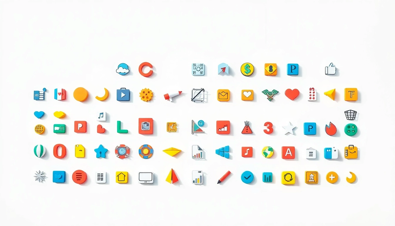
Icons are graphical representations of concepts, actions, or objects. They can take various forms, including pictograms, symbols, and logos. In the digital realm, icons are often used in user interfaces (UIs) to indicate tasks, represent functionalities, or provide quick visual references. The history of icons is deeply rooted in visual communication, originating from ancient forms of writing and symbolism where simple images represented broader meanings.
The Role of Icons in Digital Communication
In today’s fast-paced digital landscape, where first impressions are critical, the role of icons has expanded remarkably. They facilitate communication by serving as a universal language. Thanks to their simplicity, icons allow users from diverse backgrounds and languages to understand their meaning without relying on text. This aligns closely with the principles of user-centered design, which prioritizes making information accessible and understandable to all users.
Importance of Icons in User Experience
Beyond aesthetics, the importance of icons in enhancing user experience is profound. They contribute to faster navigation, aid memory retention, and encourage engagement. Research has shown that users can process visual information more quickly than text, leading to improved efficiency when interacting with digital products. Additionally, well-designed icons can provide visual cues that guide users through applications and websites, ultimately enhancing satisfaction and usability.
Types of Icons Used in Design
Flat Icons: Simplistic Design Trends
Flat icons are characterized by their minimalistic design, often lacking three-dimensional effects or gradients. This style emerged as a response to the overly ornate designs of previous years. Flat icons are favored for their clarity and adaptability across various platforms. Designers often employ this style to create intuitive, easy-to-understand interfaces aligned with contemporary aesthetics.
3D Icons: Adding Depth and Dimension
In contrast to flat icons, 3D icons utilize depth, shadows, and gradients to create a more tangible look. These icons can evoke a sense of realism and interactivity, making them particularly effective for applications that require user engagement. Their visually striking nature can capture attention more effectively than flat designs, but designers must be cautious not to overwhelm users with excessive details that could hinder usability.
Animated Icons: Enhancing Engagement and Interaction
Animated icons have gained popularity for their ability to provide feedback and guide users through tasks. They add a layer of dynamism to user interfaces, often used to draw attention to interactive elements such as buttons and notifications. However, it is essential to use animation judiciously, as overly complex animations can distract rather than assist. The key is to strike a balance between aesthetic appeal and functional clarity.
Best Practices for Designing Icons
Consistency in Style and Color
Consistency is crucial in icon design, as it helps reinforce brand identity and enhances usability. Using a uniform style across all icons within a project creates a cohesive look and feel. Coupled with a consistent color palette, this uniformity ensures that users can navigate the interface intuitively without confusion. Consistent iconography reinforces brand recognition and leads to a more harmonious user experience.
Choosing the Right Icon Size and Scale
Icon size and scale can significantly affect usability. Icons must be appropriately sized to ensure they are easily clickable and recognizable without being overwhelming. In responsive design, it is crucial to adapt icon sizes based on screen dimensions and resolutions, ensuring users can interact with them comfortably on any device. A user-centered approach to sizing considers how different users may perceive and interact with icons across various contexts.
Accessibility and Legibility in Iconography
Incorporating accessibility considerations in icon design is essential. Icons should be legible and distinguishable, even for users with visual impairments. This involves using sufficient contrast between icons and backgrounds, adopting universally recognizable symbols, and providing descriptive text or tooltips alongside icons. Prioritizing accessibility in design not only broadens your audience but also demonstrates a commitment to inclusive design principles.
Implementing Icons in User Interfaces
Placement Strategies for Maximum Impact
The placement of icons within a user interface can influence user behavior. Strategic positioning in familiar locations, such as toolbars or navigation menus, enhances discoverability. An organized layout that groups related icons together allows users to find the tools they need quickly. Attention to placement should also consider user flow and cognitive load, ensuring that icons do not crowd the interface and cause confusion.
Using Icons for Navigation and Action
Icons are often employed in navigation systems and action buttons, where their meaning needs to be instantly recognizable. Utilizing standard icons for common actions—such as a magnifying glass for search or a trash can for delete—can enhance user understanding and speed up interactions. Iterative user testing can help determine which icons resonate best with your target audience and optimize their effectiveness in guiding user actions.
Testing Icons for Usability and User Feedback
Continuous testing and gathering user feedback play crucial roles in refining icon designs. Employing A/B testing can help determine which designs yield better engagement and usability. Observing how users interact with icons in real-time can reveal insights into their effectiveness and the potential need for revision. Incorporating user feedback into design iterations is key to staying aligned with user needs and preferences.
Future Trends in Icon Design
Understanding the Importance of Responsive Icons
As digital experiences continue to diversify across devices, responsive icons have become increasingly important. These icons adapt in size, style, and functionality based on the context of use, ensuring they remain effective regardless of where users interact with them. Embracing responsiveness in icon design is critical for delivering a seamless user experience in today’s multi-device landscape.
Evolution of Iconography in Branding
Branding strategies are continuously evolving, with more companies recognizing the importance of incorporating icons into their identity. Icons serve not just as decorative elements but as powerful tools for communication and brand recognition. As brands seek to convey their values visually, the strategic use of icons will play a key role in shaping brand identities in the digital era.
Adapting Icons to Emerging Digital Platforms
With the emergence of new digital platforms and technologies, icons must adapt to various formats and interactions. For instance, the rise of augmented reality (AR) and voice user interfaces (VUI) presents unique opportunities and challenges for iconography. Designers must create icons that are not only visually appealing but also effective in conveying meaning across immersive and auditory modalities. Staying ahead of these trends will be crucial for designers looking to future-proof their work in an ever-evolving digital landscape.